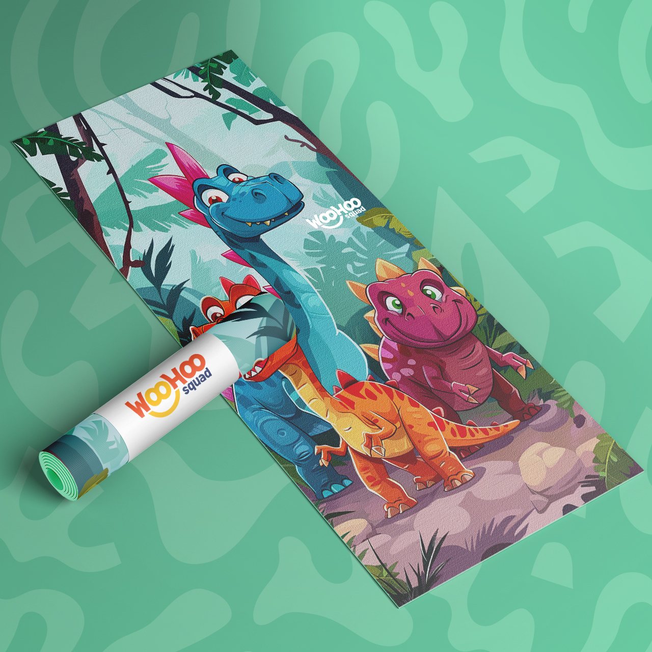
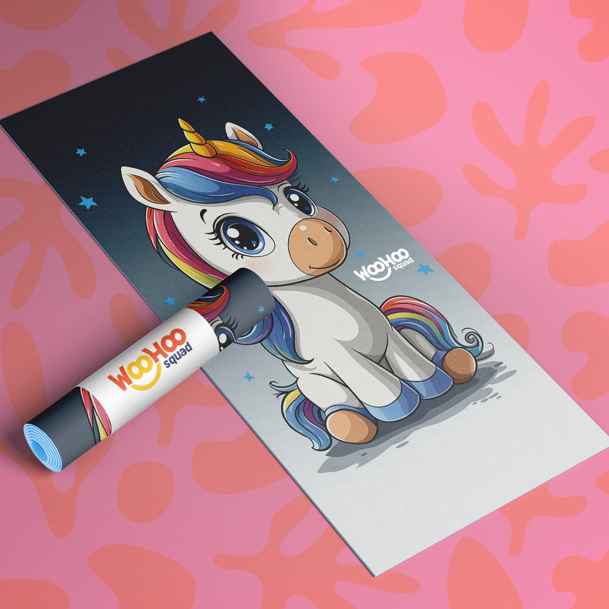
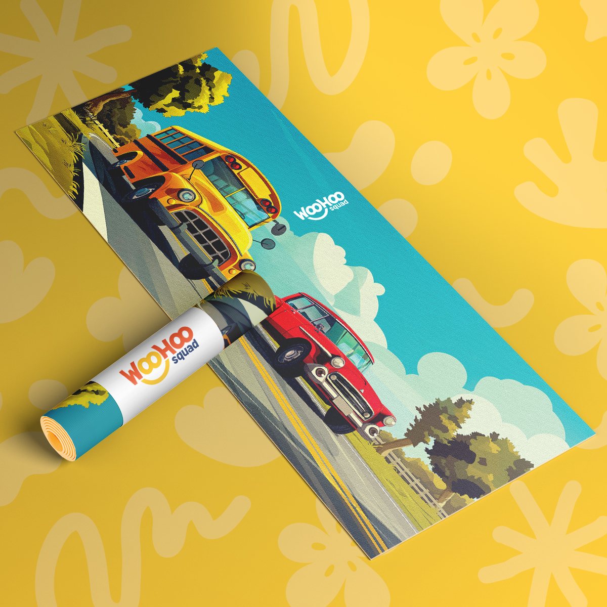
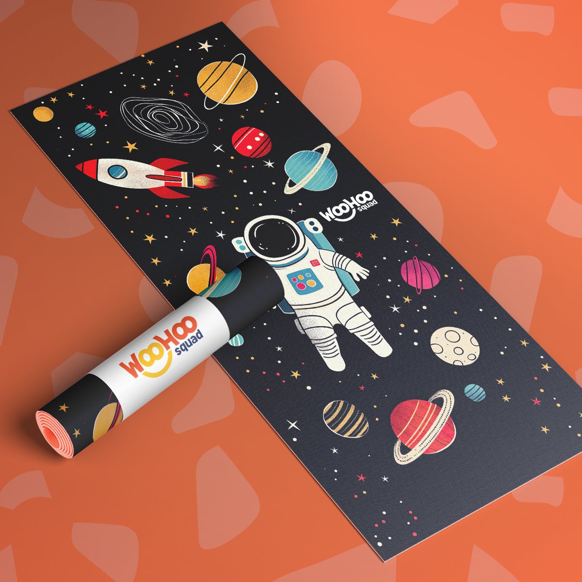
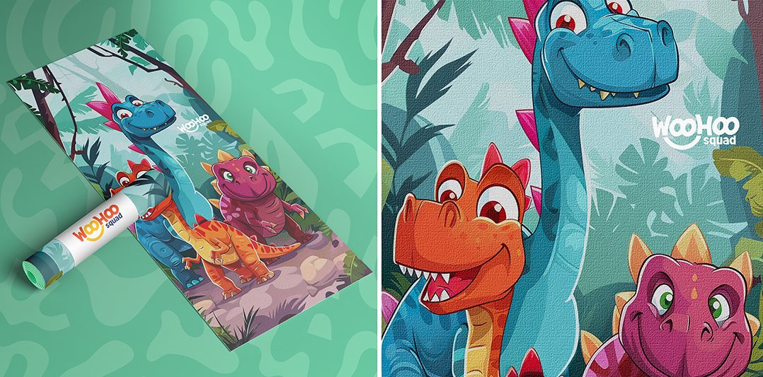
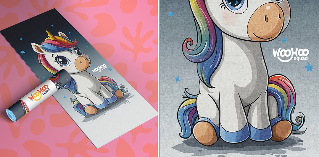
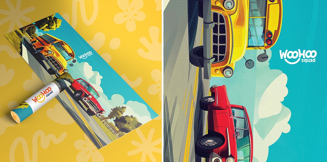
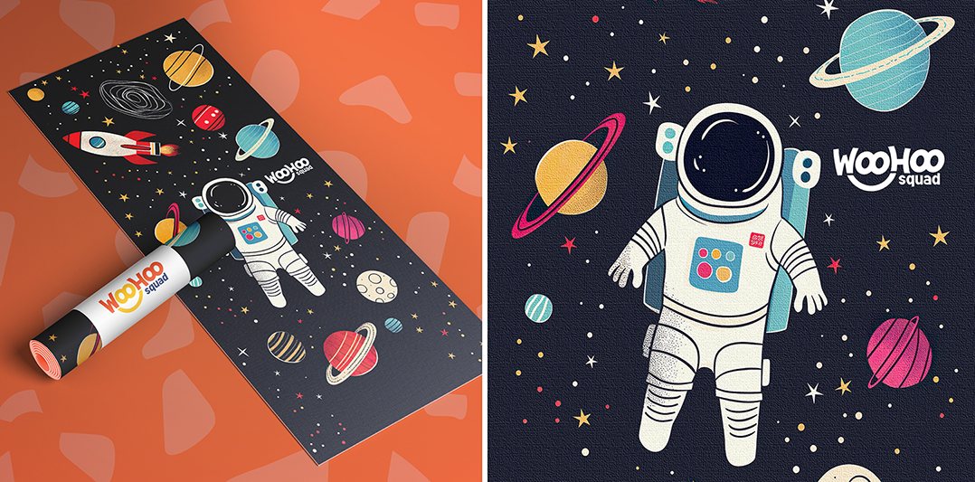
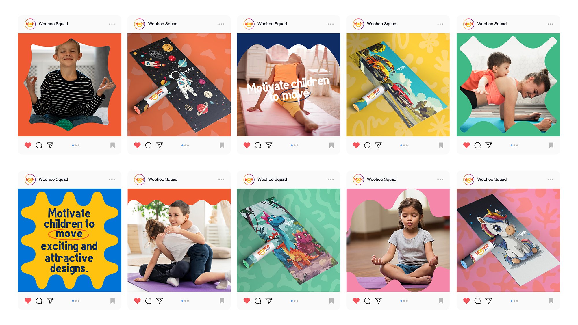
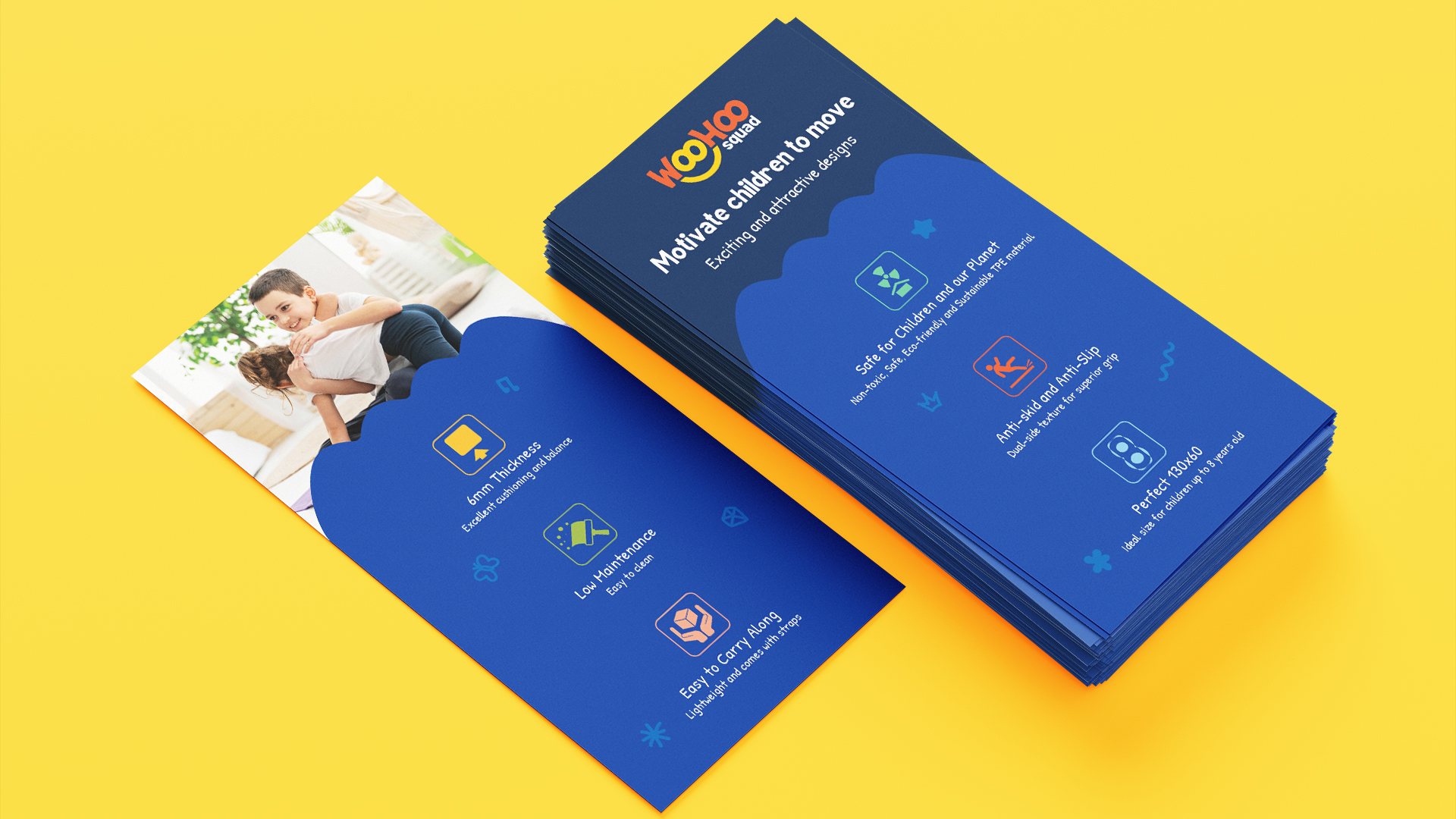
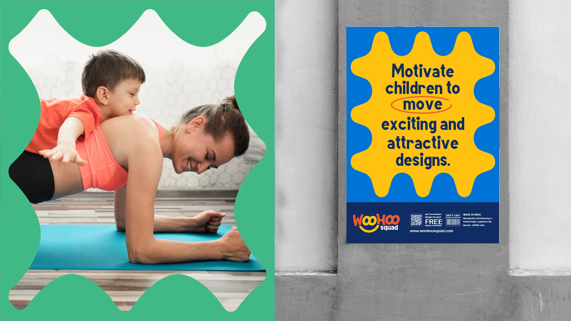
CHALLENGE: Parents understand the importance of physical activity for their children—but knowing its benefits isn't enough to make kids want to move. The challenge was to make physical activity exciting, playful and enjoyable, so that movement could become a positive childhood habit rather than another task parents have to encourage. Woohoo needed to bridge the gap between a parent's desire for healthy habits and a child's desire for fun.
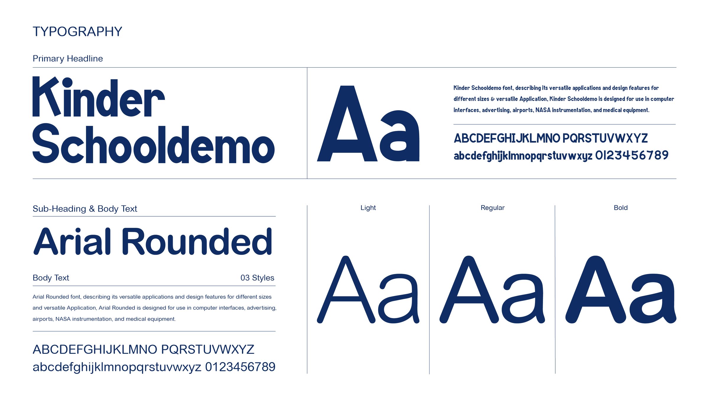
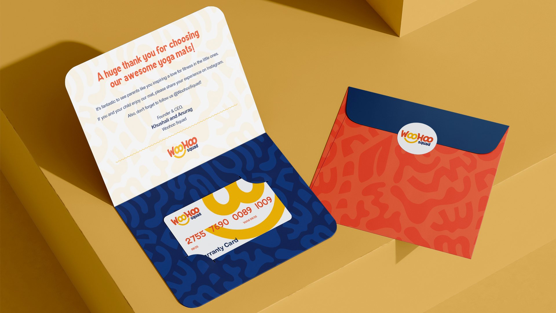
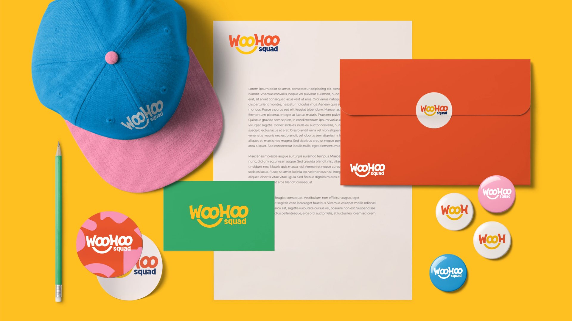
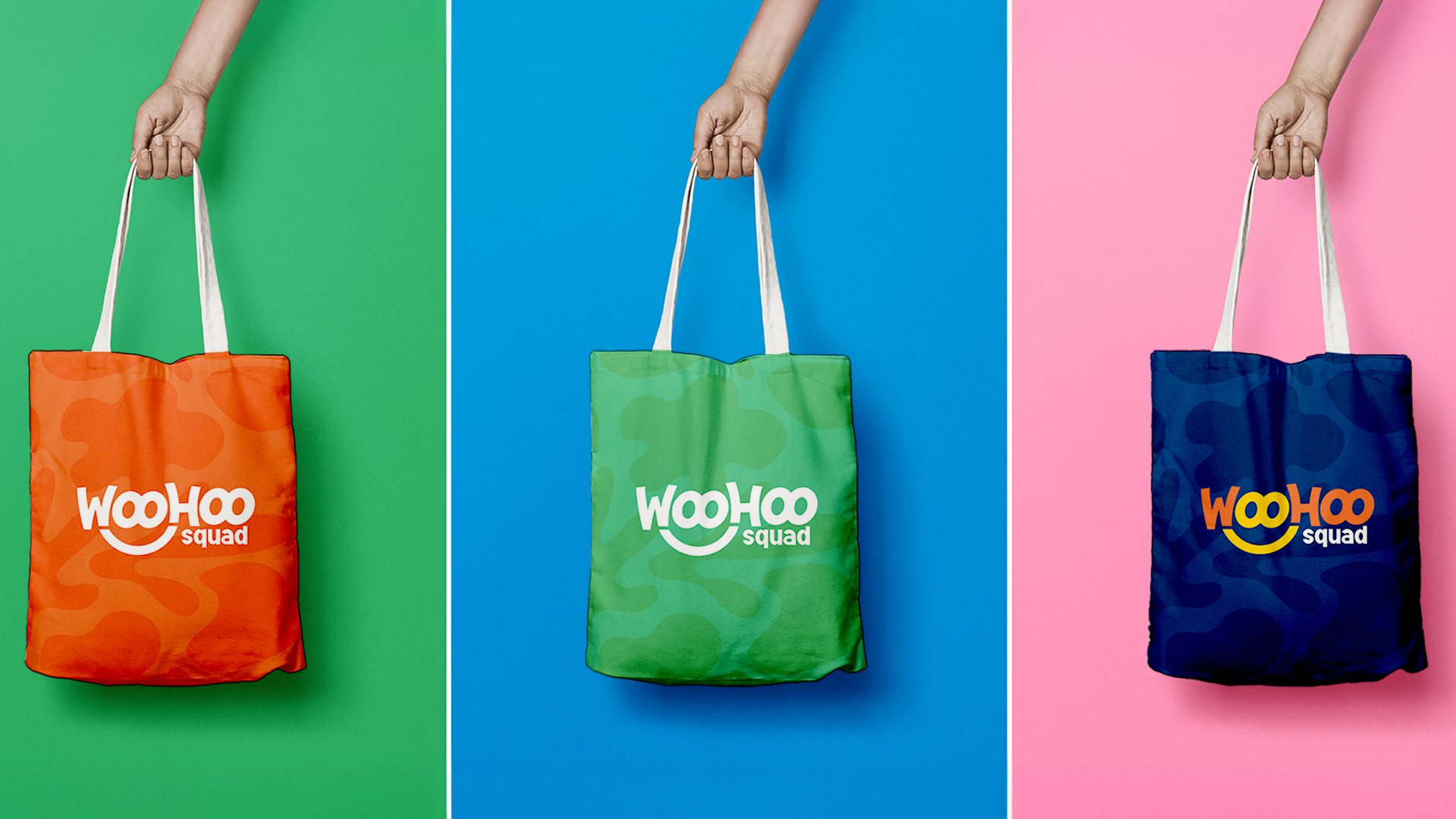
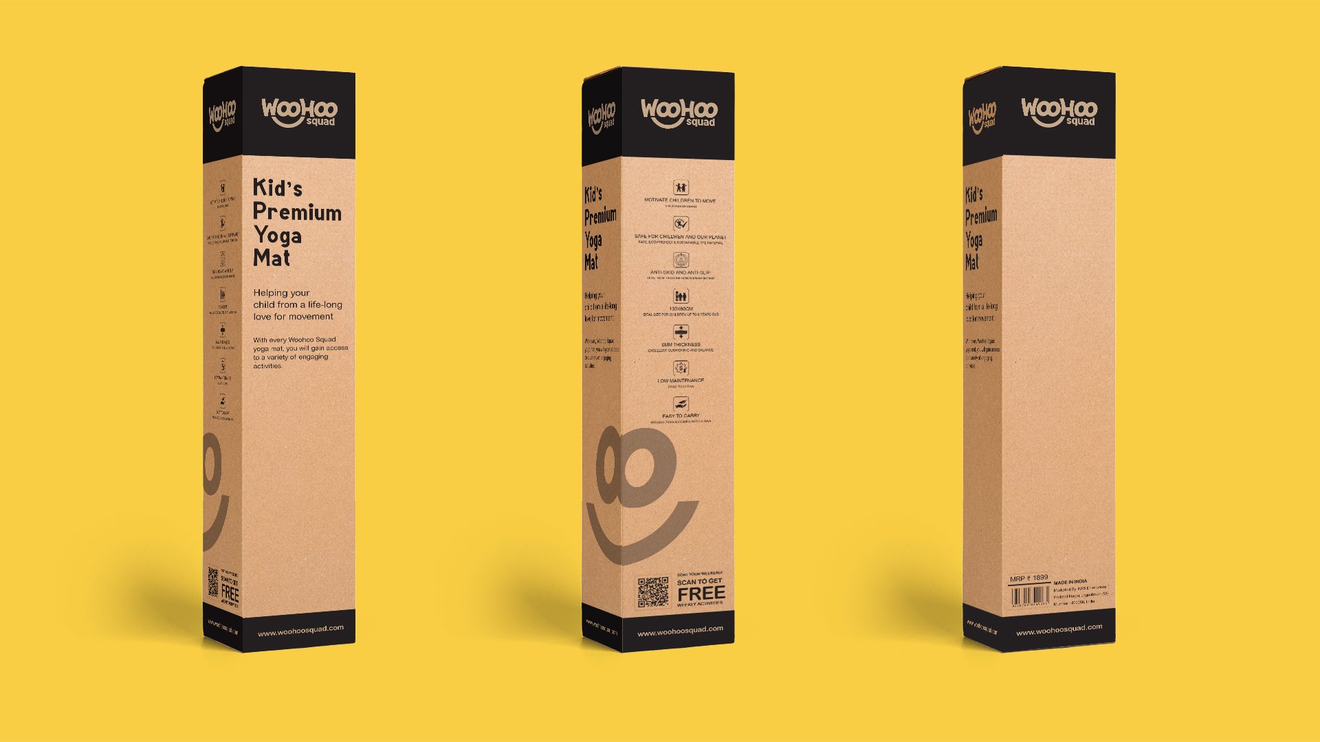
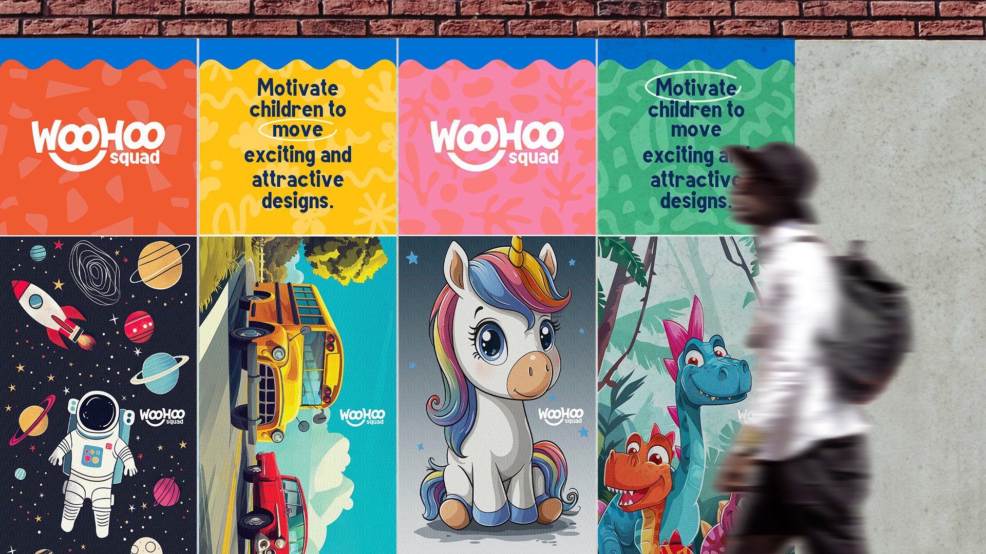
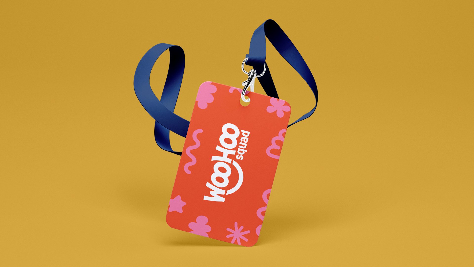
STRATEGIC CREATIVE DIRECTION: The brand identity for "WooHoo" features a modern, friendly, and playful logo-mark design inspired by an excitement emoji character. It resonates easily with modern-era parents and kids. The bold, customized, and playful typeface is fun, exciting, and energetic, giving the word-mark "WooHoo" a distinctive and memorable look. These elements convey elegance, premium quality, and sophistication, making a strong visual representation of the visual brand design system.